Web-Portfolio
▼ ▲
Learning HTML and CSS
To begin my journey into HTML and CSS I had to understand the structure behind web design and the language utilised to code this website. With the help of some web tool, I was able to problem solve my way through coding.
My Inspirations
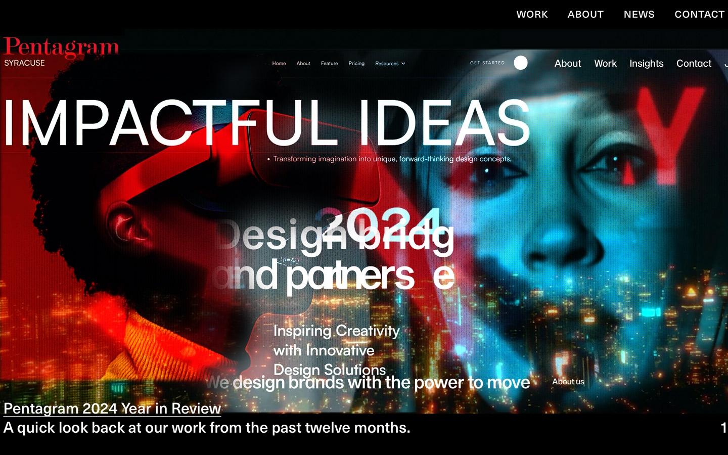
My inspiration for this project came from multiple sources and websites that I aspired to. I admired the simplicity of Pentagram’s website, which effectively showcases a vast amount of work. Additionally, visiting design studio such as Design Bridge inspired me, despite the size of their website, they maintained a simple navigation system that ensures users find their way into different projects on their website. What I liked the most was the clean layout and the way they displayed their work, which I tried to replicate with a modular grid-base approach.
Web-tools
Web tools such as CodePen, W3Schools, and CSS-Tricks.com have been incredibly helpful in visualising my ideas and expanding my knowledge beyond the initial FreeCodeCamp training. These platforms allowed me to experiment with different coding techniques and gain a deeper understanding of web development. Through these tools, I became more confident in writing with Hypertext and refining my approach to structuring and styling content. Additionally, ChatGPT has been a valuable resource, helping me explore different animations and implement interactive elements on my website, making the design process even more dynamic and engaging.
Freecode-camp
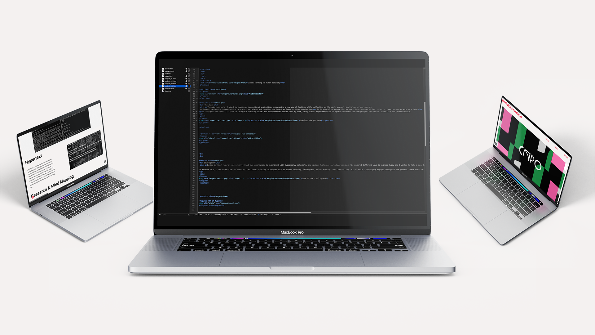
Hypertext
HYPERTEXT is a software system that links related text and graphics, allowing easy cross-referencing (freecode-Camp). Understanding HYPERTEXT wasn't easy at first, but thanks to a couple of weeks of freecode camp training online, I was able to get my head around the difference between a section, a div or a class. Although it started out basic, it allows time to process information, which can be useful in the long run.
Research & Mind Mapping

A graphical interface is like a window into the online world, with menu bars, buttons, and icons that help us navigate and interact. We use it all the time, but not always we stop to think about how it’s designed or how it actually works. We usually see the interface as just a visual tool that makes using technology easier. But it’s more than that, it is a tool which connects users with digital systems, guiding us through navigation.
UX UI
UX (User Experience) is about how a product feels and how users interact with it. It involves research, usability, accessibility, and the overall user journey, making the product easy and enjoyable to use (J. Drucker, Graphesis). Make my website easy to navigate and simple to understand, I didn’t want to overcomplicate the design or overwhelm users with unnecessary elements. UI (User Interface) is about how a product looks and works visually. It includes design elements like buttons, icons, colours, and layouts, making the product attractive and easy to navigate (J. Drucker, Graphesis). For my website, I decided to use a single font family to maintain consistency. I also kept the background box and typography colors uniform for a cohesive look. The only change occurs when a link is hovered over, ensuring a simple, clean, and visually easy-to-navigate design. Simply put, UI is about appearance, while UX is about experience.
Feedbacks
During my time at Arts University Bournemouth, I was fortunate to meet some incredibly talented graphic designers in the industry. I had the opportunity to receive valuable feedbacks on my Readymag portfolio website, which I built before this unit, from James Addison, the creative director of Forpeople Graphic Design Studio in London. His insightful feedback helped shape my decisions, leading me to keep my design simple while focusing on the details of the elements and storytelling. His input during that meeting played a key role in refining my approach.
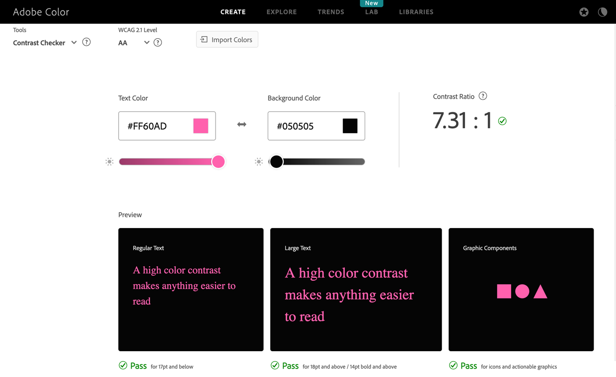
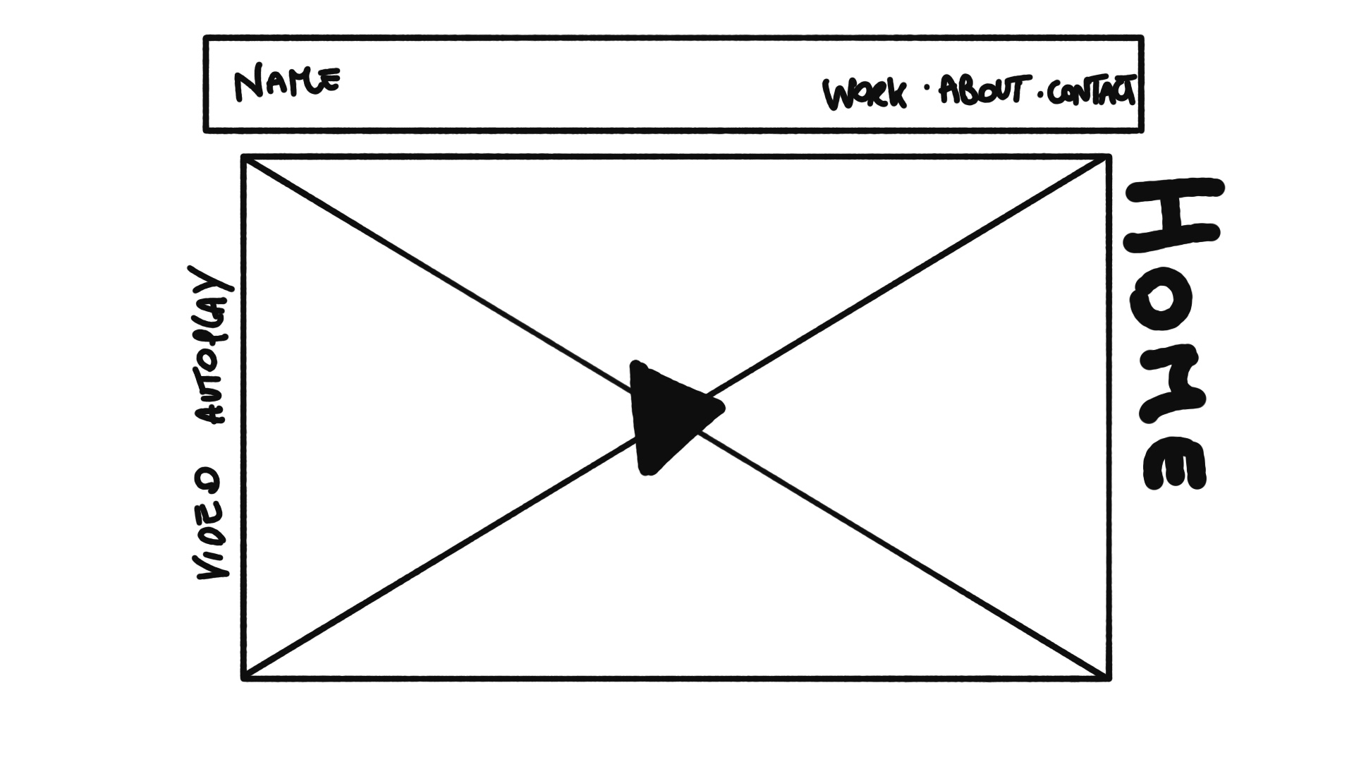
My initial approach to designing the website was to create a wireframe to plan the placement of elements. Most importantly, I needed to test how colours responded on the screen to ensure smooth readability and a user-friendly experience. Since screen colours differ from printed colours due to their light-based nature, I decided to keep a plain background. This choice allowed the images and videos to naturally balance the contrast, making the overall design visually complementary.
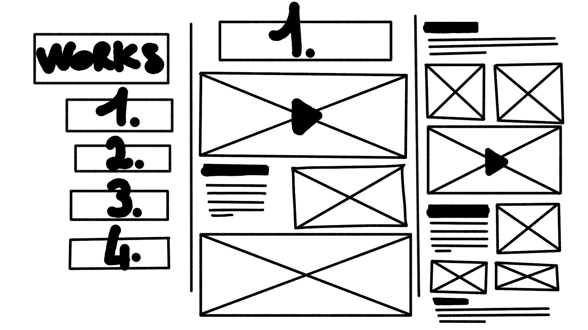
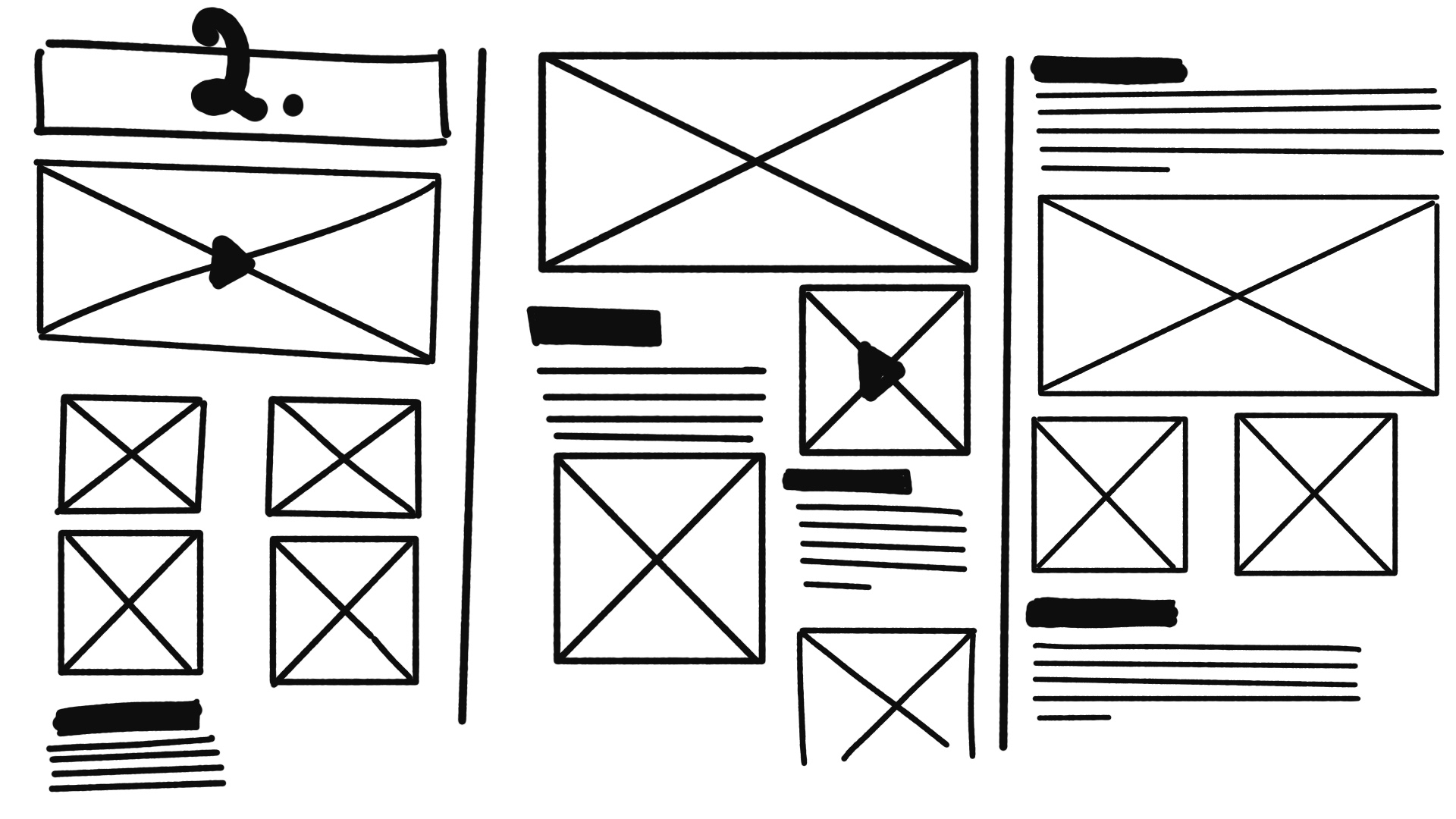
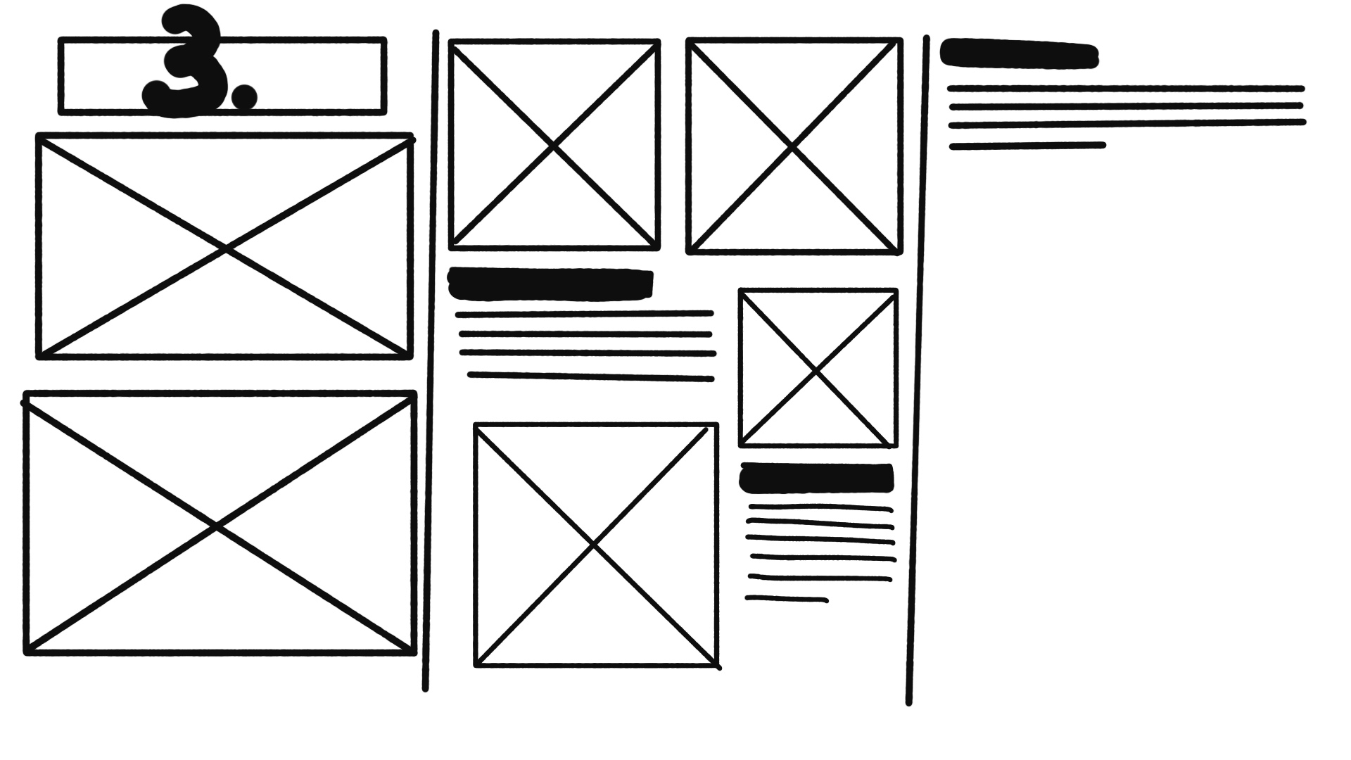
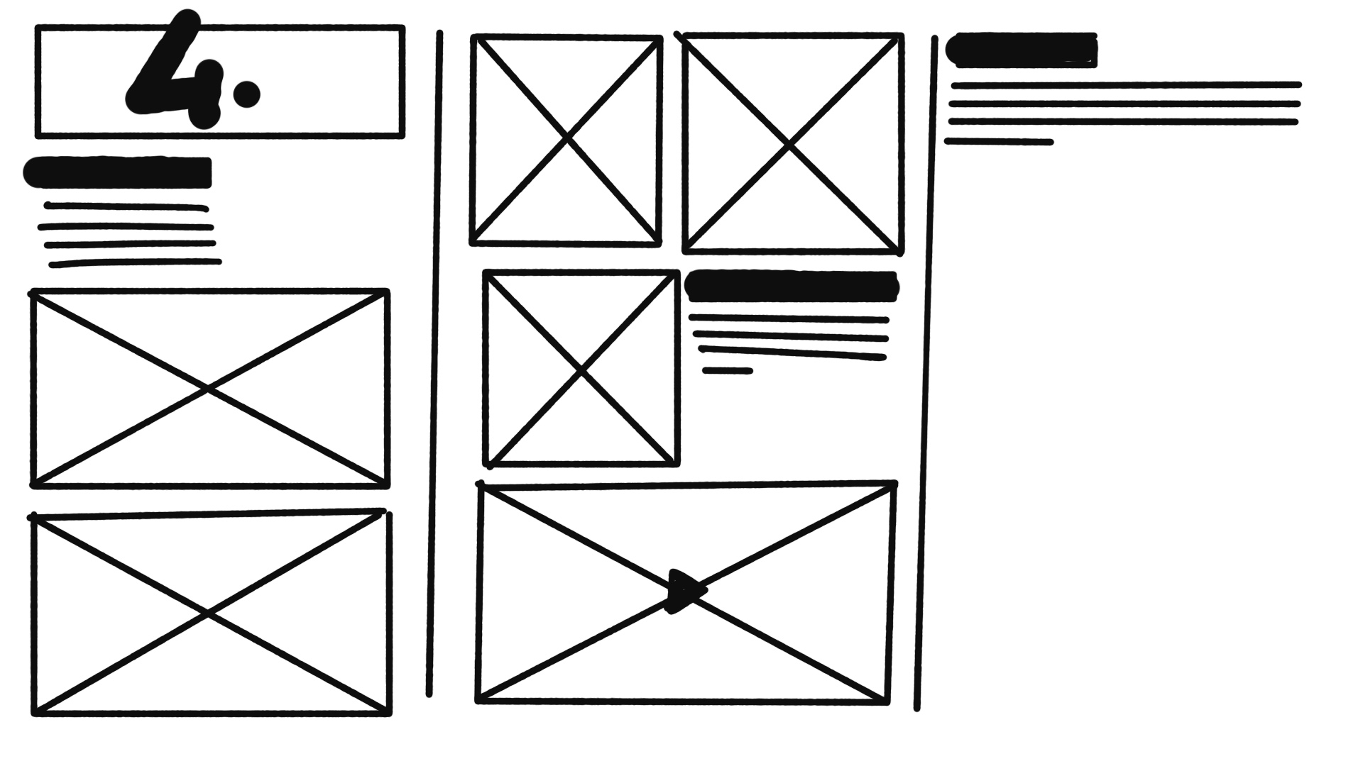
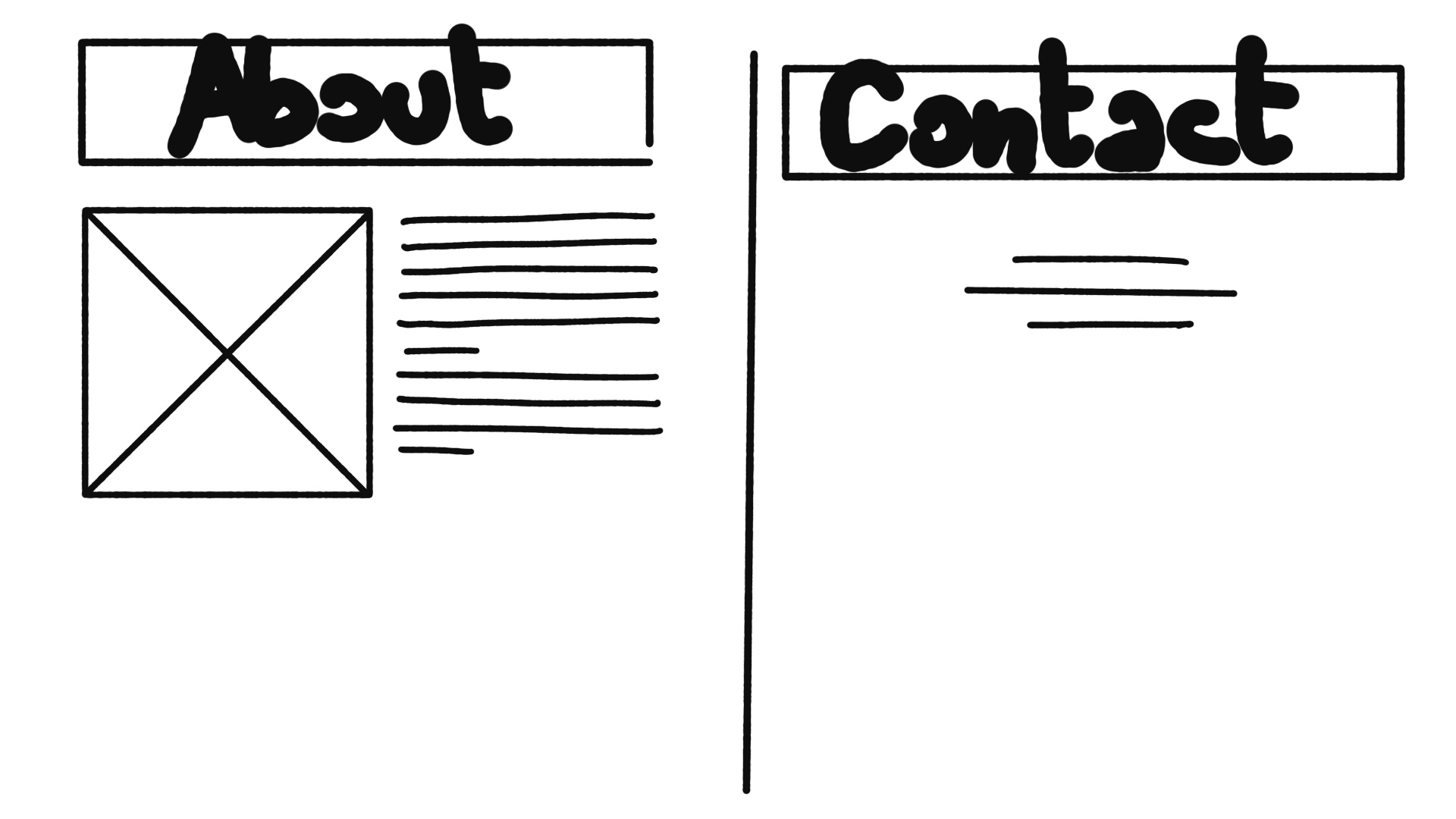
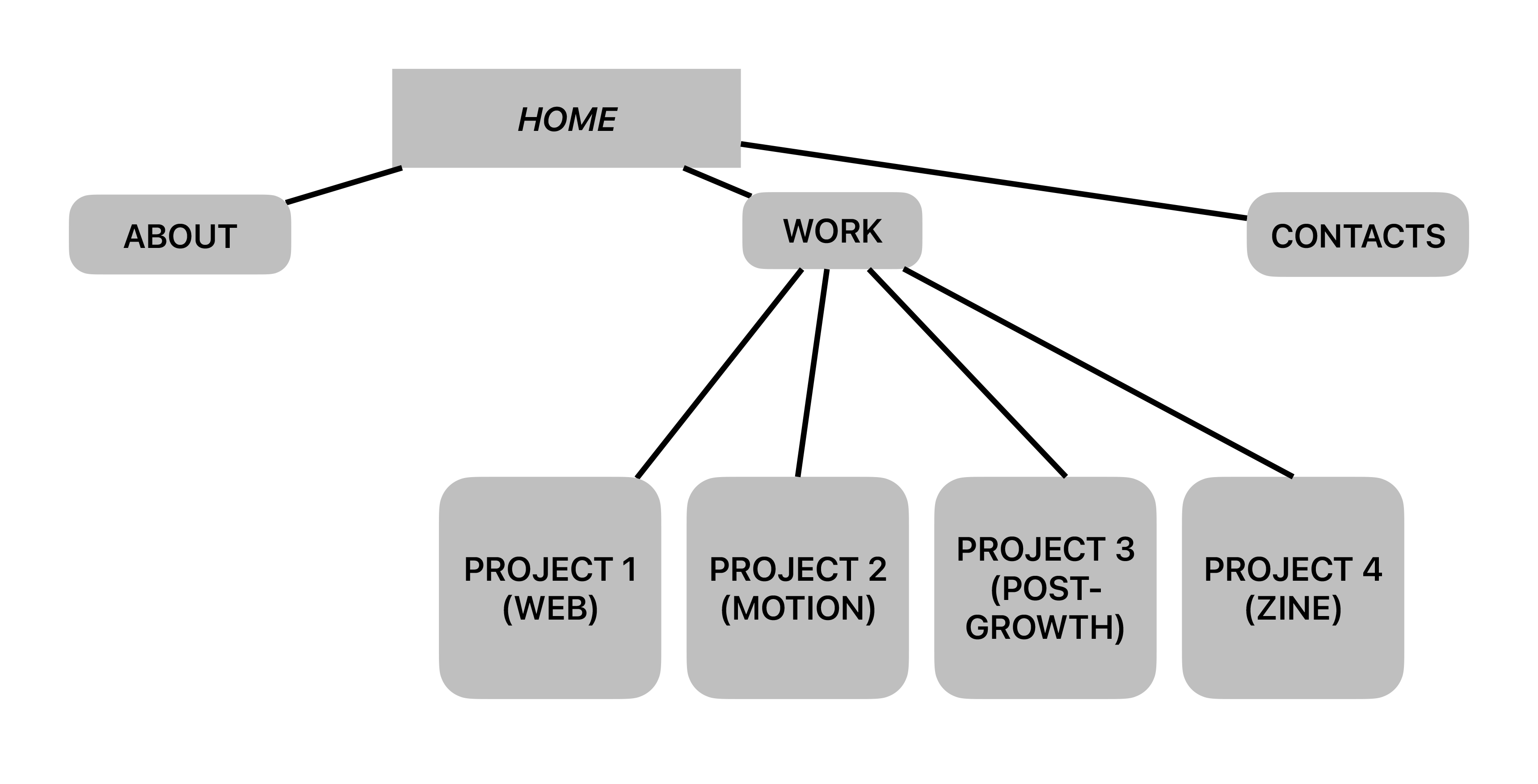
For the layout, I wanted to use a modular grid based on two to three columns, depending on the elements. However, I was particularly interested in how a two-column grid could create a balanced look between images and text. While the goal of the website was to establish my visual identity, I also considered research on the typical amount of text found in portfolio websites. After sketching different layouts, I decided on a two-column grid to maximise space for both text and imagery.
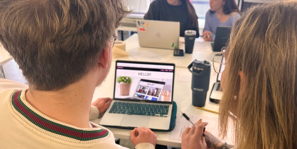
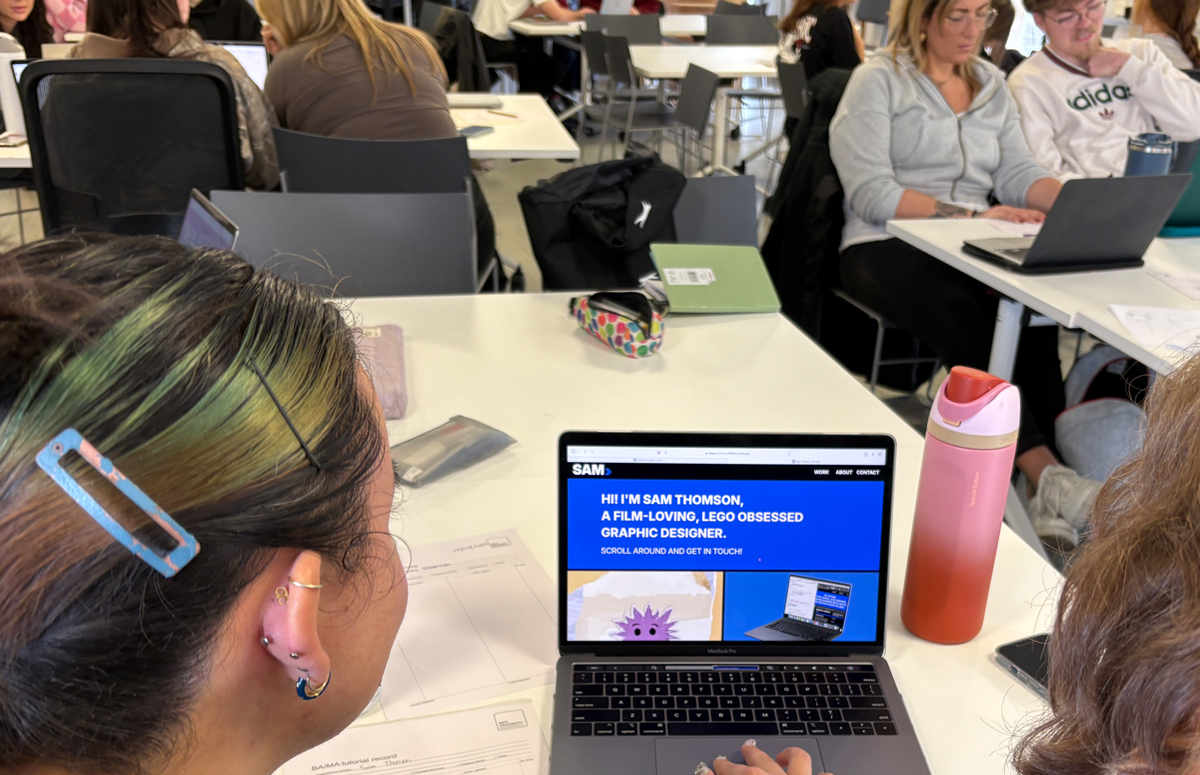
User Testing
The user testing workshop helped us identify key issues related to navigation and overall user experience on our website. It also provided valuable insights and inspiration from our peers' portfolio designs, allowing us to explore new design approaches and make improvements or additions to our own work.
Final Reflection
Throughout my studies in coding and web development, I have focused on building both technical and problem-solving skills. One of the skills I developed was understanding the principles of coding, particularly in HTML and CSS, and how these elements come together to create a functional website. By working on various templates samples, I learned how to structure clean and efficient code, troubleshoot errors, and optimise website appearance. Additionally, managing multiple aspects of web development,from design and layout to interactivity and responsiveness,taught me the importance of prioritising tasks and setting clear goals weekly to achieve the aspiring results.
This experience led me to an understanding of professional web development processes, including how to create user-friendly designs and ensure a seamless experience for different audiences, as well as looking for help on the web to find answers.
In conclusion, learning to code and build websites has been a challenging yet rewarding journey. It has strengthened my critical thinking skills, improved my attention to detail, and given me the confidence to develop a portfolio website. I am eager to continue refining my website adding some more projects along my academic and professional journey.